Dec 10
locator maps
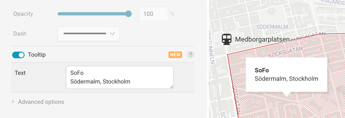
Locator Maps: New marker editor
We have redesigned parts of the upload and editing experience in Locator Maps to make creating and updating maps easier and more efficient. Give it a try!
Learn more in our announcement blog post.
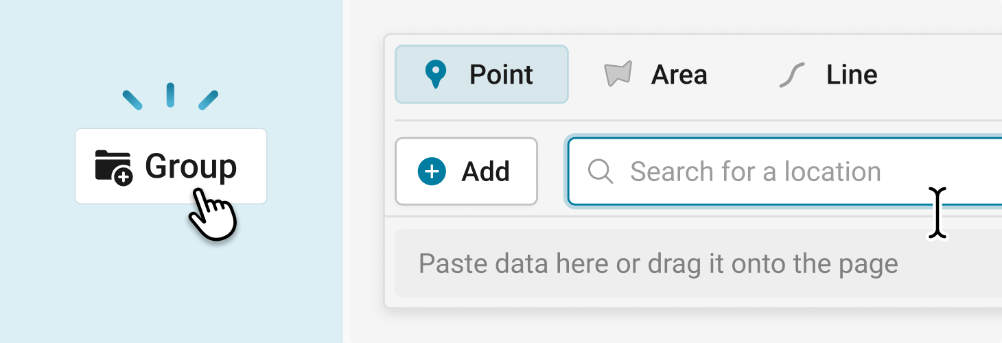
We have redesigned parts of the upload and editing experience in Locator Maps to make creating and updating maps easier and more efficient. Give it a try!
Learn more in our announcement blog post.