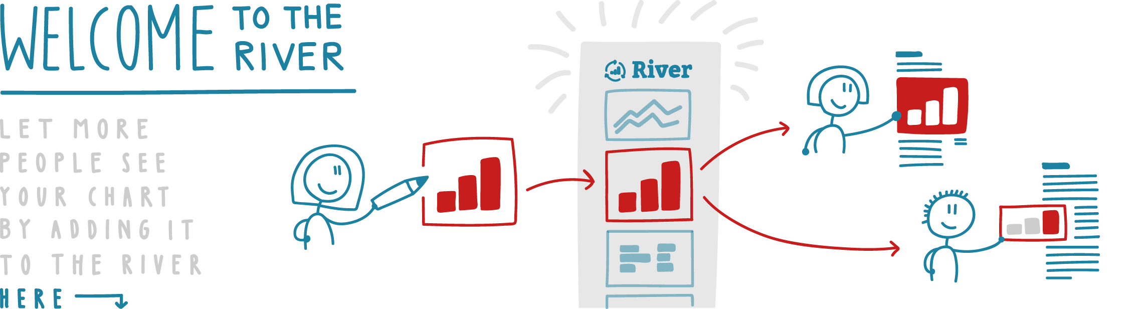
What is the River?
A place to exchange relevant data, charts and maps. Find out more in the River FAQ
Most recent visualizations
Want to add your own visualizations to the River?
Find out how in the River FAQ
A place to exchange relevant data, charts and maps. Find out more in the River FAQ
Want to add your own visualizations to the River?
Find out how in the River FAQ